Strategic Visual Identity: Maximizing Efficiency and Impact in International MICE
When it comes to cutting budgets for international conferences, "design fees" are often the first thing to be discussed. This is because many organizers instinctively think, "As long as the information is accurate and the text is clear, is it necessary to spend money on professional design?" However, in the eyes of professional conference consultants (PCOs), visual design is not just about being "pretty." It not only determines the brand's value but also directly affects on-site execution efficiency and social media reach.
I. The core purpose of visual design: to build "trust" and "proactive promotion"
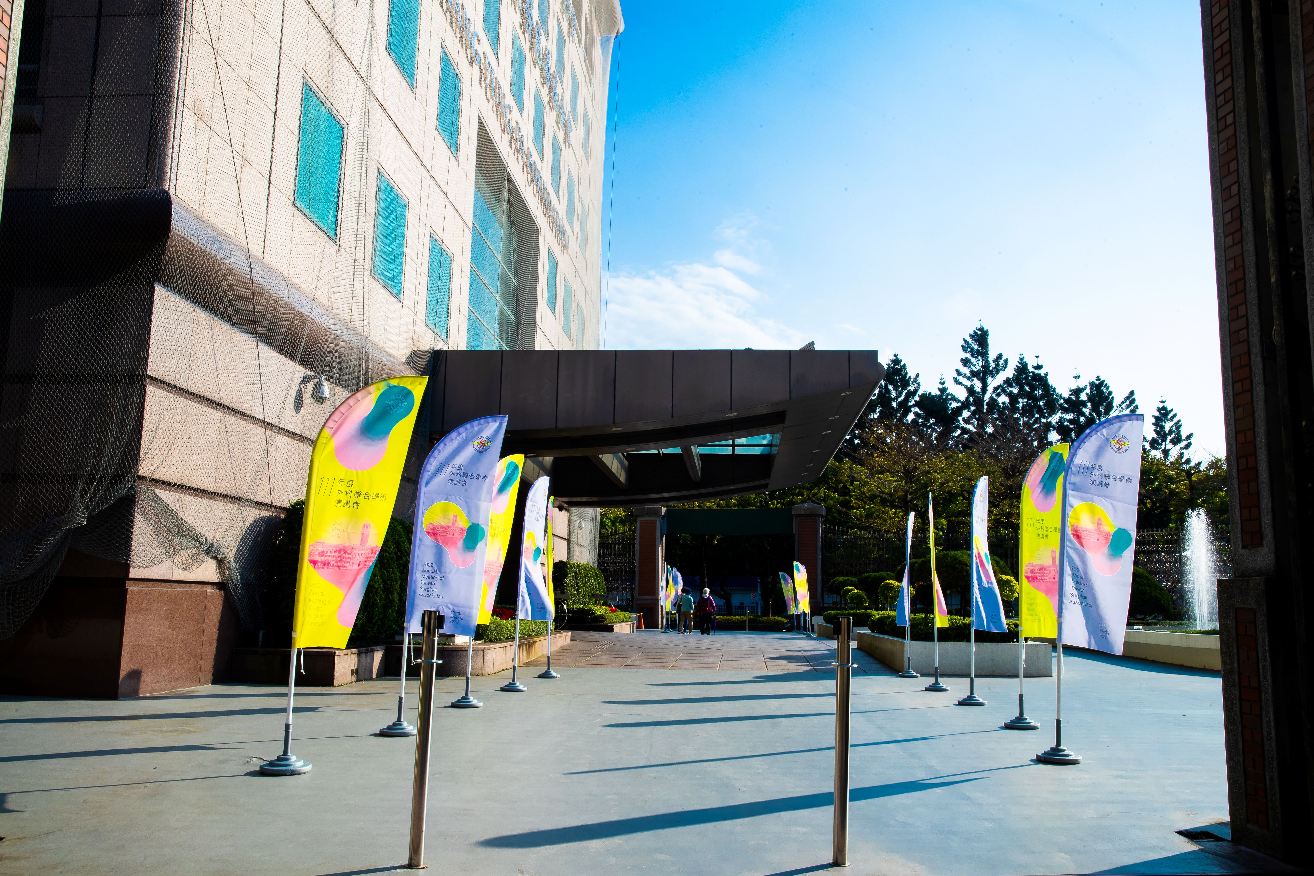
- Authority and Brand Value: The core of an international forum is "professional exchange," and the first impression of professionalism often comes from visual appeal. Professional design will make attendees expect a high-level event, thereby increasing their willingness to attend.
- Spontaneous promotion in the social media age: In an era dominated by social media, "aesthetics are a competitive advantage." A well-designed welcome backdrop or stage display will prompt attendees to spontaneously take photos and share them. This kind of "proactive exposure" from attendees is more effective than ten articles published by the organizers.

II. Impact on Participants: Design is "Silent Guidance"
Good design can make guests feel at ease, especially in unfamiliar venues.
- The Uniqueness of Visual Signage: When hosting an event in a large, professional venue, multiple meetings may be taking place simultaneously. If the design is cluttered or lacks distinctiveness, attendees cannot quickly determine "Is this the place I need to go?" based on colors and patterns. Clear visual signage can alleviate anxiety and ensure attendees are seated on time.
- Improve focus: Clear stage visuals can reduce eye strain, allowing attendees to focus on the content of the presentation rather than being distracted by a chaotic layout.
III. Avoid "ineffective communication": stop playing " mind-guessing games "
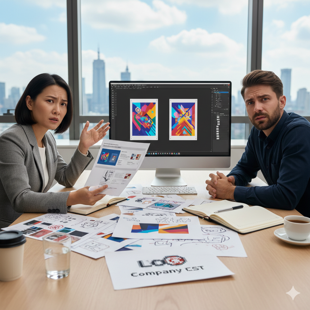
If the organizers don't have a clear idea about the visuals, they often ask, "Please have the designer make one or two designs first." This is often the beginning of a nightmare.
Without information exchange, designers can only guess at the meeting name . When you see the first draft and say disappointedly, "This is not the feeling I want," but can't explain "what feeling it is," this ineffective communication not only stifles creativity but also delays the schedule, forcing you to reluctantly accept an unsatisfactory work as the deadline approaches .
💡How to have an "effective conversation" with a designer?
- Visual Reference Board: Find 3-5 reference images that you feel "fit" to align with your aesthetic goals. Designers won't plagiarize, and organizers shouldn't expect the final design to be exactly the same as the reference images; the key is a shared aesthetic style.
- Clearly define the "function and environment": Designers need to know in what situations this drawing will be applied. Is it used in a banquet hall with a five-meter high ceiling, or in a narrow corridor? What are the maximum and minimum usage areas ? This determines the level of information presentation.
- Define the color framework: If you have a corporate identity color, please provide it immediately. If not, please provide a color scheme reference image to directly match the color tone of the final design.
IV. Design actually helps you save on-site manpower and protect your budget
When reviewing budgets, organizers often ask , "The main visual is finalized, so why do we have to pay for the extended design?" or "I 've provided the images , so why do we have to pay for the final artwork?" This is actually the key to transforming design from "aesthetics" to "engineering":
- Key visual design: It's like buying a distinctive piece of Issey Miyake pleated fabric , but when applying it to a top, skirt, or bag, a tailor still needs to cut it according to various styles (design rollout), and ensure that the zippers and seams are in the right positions and do not get stuck or uneven (final artwork).
- Design Rollout: When applying the main visual design to a 10-meter stage backdrop, a narrow ID badge, or a square social media post , it's not simply a matter of "scaling up or down." Designers must recompose the image and adjust the information hierarchy according to the proportions of the medium. This is the expertise required to ensure that the brand's aesthetics maintain a certain quality in any context.
- Final Artwork: This is the last line of defense to ensure "what you see is what you get," because large-format printouts are not photocopies, and proportional scaling may not meet the required size on-site. Therefore, even if the organizer provides a ready-made image, the PCO still needs to check for print bleed, adjust the resolution to the large-format print standard, ensure there are no missing images or incompatible fonts, and sometimes even readjust the size.
- Intangible savings and gains in manpower:
- Efficiency is money: A visual flowchart is better than ten explanations from staff; well-designed signage will prevent congestion at the check-in counter.
- serve as an invisible driver to attract sponsors and increase sponsorship rates.

V. Core Misconception: Meeting Visual Design is "Not" an Advanced Version of PowerPoint
The most common, albeit gentle, misunderstanding we hear is: "Um... we've already included the logo in the PowerPoint presentation, so the designer can just use it, right?"
- Word processing software is not graphic design software: PowerPoint is for conveying information, but visual design is about "spatial engineering." When your logo is pasted into a Word or PowerPoint presentation and sent to graphic design software, it's just a "shrunken mosaic." When we insist on receiving vector graphics files ( .ai ) , it's not to add to your burden, but to protect your organization's image and ensure that your logo doesn't look like a "mosaic tile" when placed on a large backdrop.
- A small change can have far-reaching consequences: modifying a single word in a PowerPoint presentation is quick, but changing a color tone in a professional visual design means that all printing adjustments, including color matching and bleed areas, must be re-checked, from identification badges and signage to websites. We understand your urgency, but we're even more concerned about your mistakes! The role of a PCO (Printer Operations Officer) is to help you avoid the disaster of " discovering broken text only after printing ."

On the international stage, language may create barriers, but vision does not.
A successful international forum conveys a silent sincerity through visual design: "We are ready, we are professional, and we care about every distinguished guest who has traveled from afar." Design fees are never just a simple expense; they can be transformed into order on-site, brand premium, or even a photo that a participant actively shares on their phone.
If you're stuck in a cycle of anxiety about "the image file being in Word" or "the designer not understanding me," perhaps what you need isn't more design drafts, but a meeting consultant who can use both hemispheres of the brain.
As professional PCOs, we excel at empathizing with your brand vision and then rationally translating it into professional specifications that our printing plants can accurately output. We not only save you unnecessary communication hassles, but also help you avoid all hidden visual pitfalls in this marathon-like preparation process, ensuring that the final product reflects the international standards your organization deserves.
.jpg)

.webp)


